
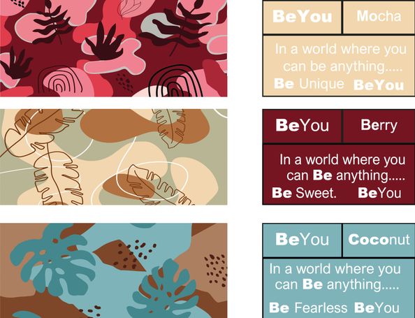
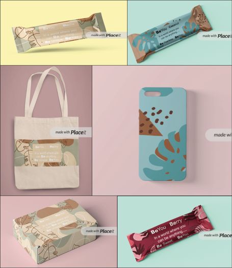
Packaging for the UK’s newest health bar.
Beyou are enlisting a designer to provide them with a brand that will disrupt the health food market, whilst maintaining a fashionable aesthetic. It is important, when exploring your creative options, to enquire they express Beyou's quirky brand personality in both their identity and brand messaging.
Early brand success will be heavily dependent on social influencers, so the brand must be sharable and likeable. The initial marketing strategy is to give free samples to many of the industry's biggest healthcare influencers, and then use their imagery to lead any advertisement campaigns. The brand must feel like a fashion item; something that young women would want to share and buy. Think bright colours, expressive patterns, bold typography and clear brand messaging.
Along with the brand framework, the client would like you to produce a marketing campaign that will boost the brand name during the launch. The brand should naturally develop into a campaign that really sells the lifestyle aspect of the product, making it feel aspirational and also approachable for young women.

A.R.E.S
One of the Doctors I work with wanted a Logo Design for a course he was running for Emergency Clinicians. The course "Advanced Resuscitation Emergency Skill" was shortened to the acronym "A.R.E.S"
The name immediately stood out as the Greek God of War - Ares - so the the first area I researched was the myth and symbology of the God of War. I began creating my design by drawing helmets, spears, shields and using the colour theme that is most associated with - Red and Gold. Although a good starting point I quickly dropped the idea as it felt to obvious and cliched, as well as not indicating what "A.R.E.S" was - was it a clinical course (which apart from the name has nothing to do with Roman Myth) or something else?
I met with my colleague again to really understand what it was he wanted (a very modern, clean, logo) and created different types to use for the name. I began by adding an arrow or spear to the type - to create some moment, drama and to keep the link to the original symbology, but quickly dropped the symbology altogether; let the type be the main focus. Finally I added a heartbeat over the top of the type to link it back to medicine and health, this was changed from a 'generic type' of heartbeat, to be a much more realistic representation of a heartbeat on an ECG to be instantly recognisable to Doctors and Clinicians seeing the logo.
I changed the colours to be a very dark blue and 'Blood Red' (Hex Code: #8a0303) and added "Advanced Resuscitation Emergency Skills" underneath in the same Red colour as the Heartbeat.


© Copyright. All rights reserved.
We need your consent to load the translations
We use a third-party service to translate the website content that may collect data about your activity. Please review the details in the privacy policy and accept the service to view the translations.