
Magazine Layout
A editorial for a surfing magazine
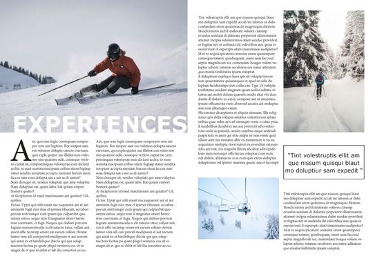
Wipe Out Magazine is one of the leading surf magazines in the world. They are looking for a fresh new look and feel for their magazine. The magazine is packed full of interviews with some of the most reputable and legendary surfers from across the globe.
To appeal to both the younger and older demographics, they want the design to feel stylish and fashionable, but with an old-school twist. To get an idea of the creative direction, they would like to see a double page magazine spread, with a clear and defined route for the design which they will then plan to roll out across their magazine for 2020 and 2021. They are open-minded to the content you choose to include in the designs, as at this stage the focus is on the aesthetic. The only requirements is it must include action-based images of surfers - so, no images of surfers walking down the beach - and clear defined styles for main titles, sub headers, body text and pull quotes.
Wipe Out Magazine has an adrenaline fuelled brand personality, and they want to convey this feeling in the new design style.
This is a full colour, printed magazine.


Custom luggage tags
To choose a few destinations that either mean a lot or that have some connection with, and create a collection of custom luggage tags based around these places.
There are a lot of designs of luggage tags, which can start to look quite similar.
I decided to use London, New York and Sydney as places I've visited and mean a lot to me. I used digital, quite geometrical illustrations of things unique to each destination - the flag of the country, buildings, people or wildlife which help to make my designs unique.


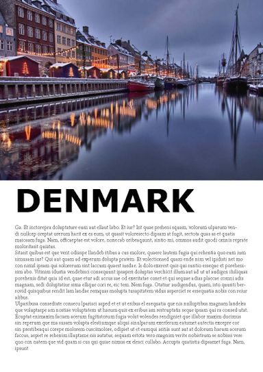
Travel Brochures.
I love travelling and exploring new places. I have started experimenting with Travel Design. I have started a couple of series of travel brochures:
- Designing Travel Brochures for travel, one for each of the 4 seasons; I have started with Winter, looking at the most popular Winter destinations, experiences and activities.
- Designing Brochures and Posters inspired by places I have travelled too; I have started with St Lucia, having been the most recent place I've travelled to.
I have used images either that I have taken myself, or use stock photos. These are still works in progress, but I have included some of the work I have already completed.


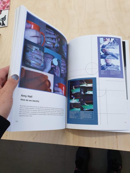
Mid Year Exhibition Show 2019
I helped design and layout the information brochure, for our Mid-Year Exhibition Show in my final year at University, This included gathering all the details, information and photos from my colleagues, planning the layouts and getting them all printed.

Menu and Invitation Designs
I have created invitations and menu designs for various events. I've used general copy for some of the invitations, and not the original I was given.
I used the theme of the events to create the invitations; Strawberries and Pimm's, Geometric flowers and and invitation to the Pantomime Aladdin.


Children's Wildlife A-Z Book with illustrations
Children's Alphabet Book
As part of my final project I created an alphabet book for children. Each letter of the Alphabet was represented by an animal native to the UK. I designed and created a book as part of my final submission.


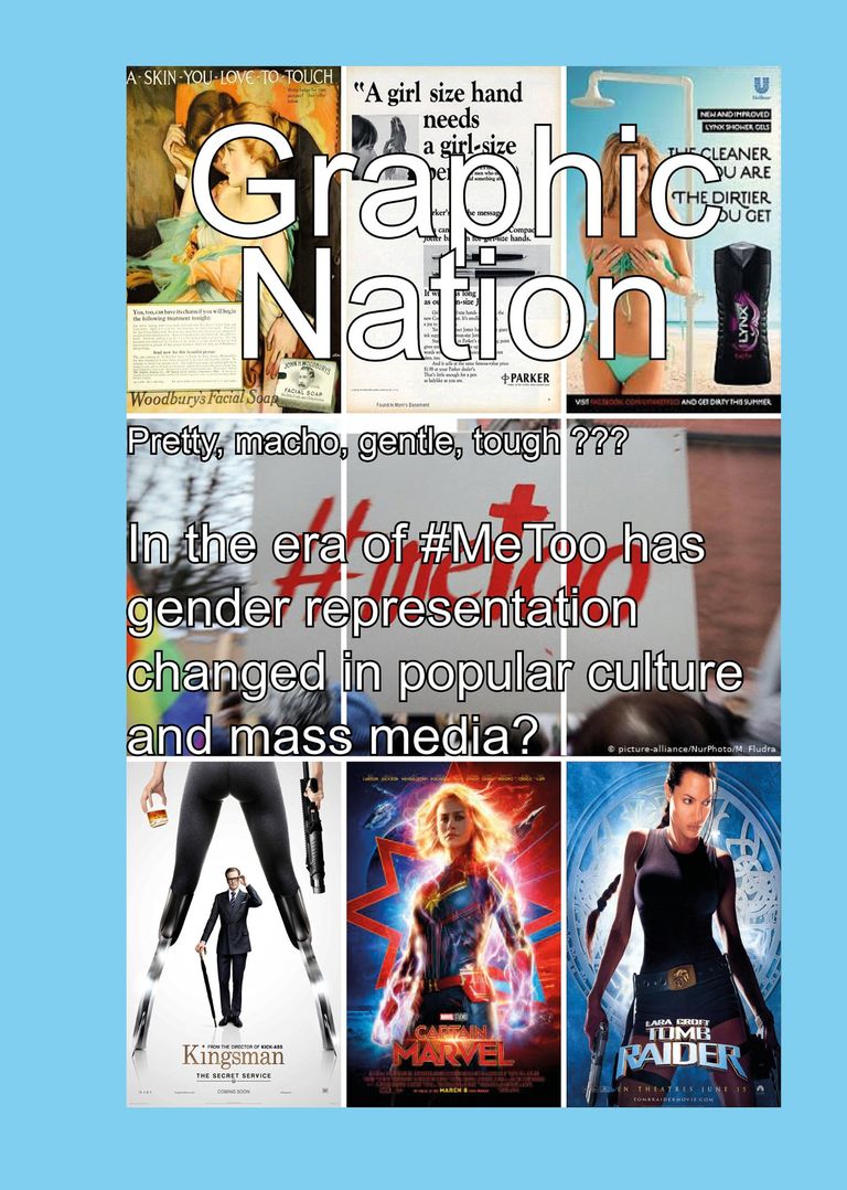
University Dissertation
My final Dissertation at University focused on Gender and it's representation in popular Culture and how this had changed in the era of #MeToo.
After writing my 10,000 word dissertation I used this, and photos I had taken to design a publication style layout.
The idea of the photos I took as part of this project was to show that people are much more than the Gender they choose to portray; they are also friends, partners, mothers, fathers, husbands and wives.


Alone Together: Project to combat Loneliness
Following research I leant that young people often feel the loneliest - despite common understanding that older or elderly people are often the loneliest . Young people often feel loneliest at 18/19 years of age when there are big life changes - they've finished school, often started university and moved away from home, their family, friends and are living by themselves for the first time.
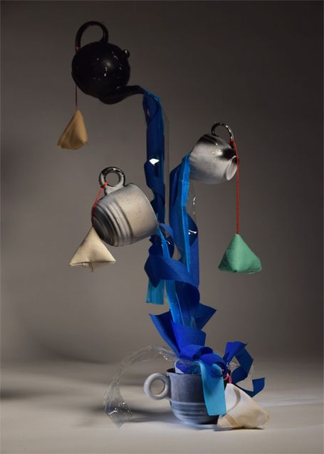
Looking at how Universities can help students and young people navigate these changes I noticed that - although Unions have societies and clubs - these are often focused on sports and/or drinking, excluding those who don't like sports, are unable to participate in sports and who don't drink. I wanted to create a system of support where students could come together without sports or drinking - so I created 'Tea Clubs' and built and photographed a sculpture which could be used to advertise the club.
This was my final piece - a sculpture of a teapot and mugs, with tissue and crepe paper which represent water pouring out of the teapot into the tea mugs. Fabric tea bags were also hung on the sculpture, filled with dried lavender. The idea for this was that it could be used as an advert for 'tea-clubs' and used during tea clubs as a focus or discussion point.
© Copyright. All rights reserved.
We need your consent to load the translations
We use a third-party service to translate the website content that may collect data about your activity. Please review the details in the privacy policy and accept the service to view the translations.